Some of the most memorable interiors are those that embrace color with confidence. Rich blues, warm ochres, expressive greens, and unexpected touches of pink can bring extraordinary personality to a room, particularly where the colors feel thoughtfully connected.
While a beautiful color palette can start with a favorite fabric or a carefully selected wall color, we believe fine art offers an especially inspiring place to begin.

A colorful landscape, expressive abstract, or painterly botanical can introduce shades you might never have considered pairing together. When those colors carry through upholstery, textiles, and architectural details, the result feels layered and personal rather than overly coordinated.
The secret to colorful interior design isn’t simply introducing more color. It’s knowing how to create a beautiful relationship between the artwork, furnishings, and surrounding space.
Why Art Is the Perfect Starting Point for a Colorful Interior
There’s a certain confidence to a room where color feels expressive yet beautifully balanced. Often, that sense of harmony begins with the artwork.
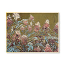
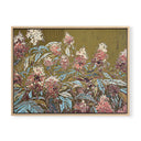
A thoughtfully chosen painting brings together colors, movement, and composition in a way that can inspire the entire space. Consider Pink and Green by Love Katie Darling, an expressive botanical composition that brings two lively colors together in one piece of fine art. A rich green accent chair or pink-patterned upholstery could carry those shades into the surrounding room, creating a colorful interior that still feels beautifully considered.
In a living room, a substantial piece of fine art above the sofa can establish a natural focal point, drawing attention and giving the surrounding furnishings a sense of direction. Whether you prefer bold colors or more subtle shades, the right artwork can transform the mood of an entire room, creating a cohesive look that still feels personal.
And perhaps most importantly, choosing artwork you genuinely love gives the room a personal point of view. The result is a colorful interior that feels collected over time rather than designed around a passing trend.
Let Fine Art Lead Your Color Palette
Once you’ve found a piece of artwork you love, look beyond its most prominent colors. Some of the most interesting design possibilities come from the smaller details that give a piece its depth and character: a hint of ochre in a landscape, a deep burgundy brushstroke in an abstract, or a soft blue tucked among vibrant florals.
Choose one or two shades to repeat throughout the room, then let the remaining colors appear more subtly. For example, a painting with rich blues, golden yellows, and touches of pink might inspire navy upholstery, patterned throw pillows, and a warm ochre accent chair. Neutral furniture, natural wood, and woven textures can balance the brighter shades, giving the room depth without taking attention away from the artwork.
You don’t need to match every shade perfectly, either. In fact, slight variations in tone often make a room feel more layered and interesting. Whether you’re working with your favorite color or exploring an unexpected combination, the goal is to connect the artwork to the surrounding furnishings while letting each element keep its own character.
Bold Color Combinations That Feel Timeless
Bold colors don’t have to cover every wall to make an impression. Some of the most striking interior spaces combine expressive artwork with neutral colors, classic furnishings, and smaller bold accents that add character without overwhelming the room.
Here are a few color combinations we particularly love for creating spaces that feel expressive, sophisticated, and full of personality:
Pink and Green: Playful Meets Traditional
Pink and green are a natural pairing, especially in interiors that combine traditional details with a more playful approach to color. Think deep olive upholstery, soft blush walls, and patterned pillows that bring both shades into the room.
A colorful botanical can feel especially at home alongside antique wood furniture, decorative millwork, and warm brass accents. The contrast between expressive artwork and classic architectural details adds contrast, visual interest, and a sense of character.
Aqua, Pink, and Golden Yellow: An Expressive, Layered Palette
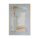
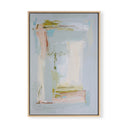
For a more colorful approach, consider the La Dee Da Pair by Charlotte Pottieger, a vibrant abstract pairing that brings together aqua, pink, golden tones, and other playful shades.
In a living room, soft aqua upholstery could establish the foundation, while pink-patterned throw pillows and golden yellow accessories introduce warmth and contrast. Natural wood, creamy linen, and a simple rug help balance the brighter colors, creating an inviting environment that feels lively without becoming overwhelming.
Because the artwork already brings these shades together, the room can feel beautifully layered without relying on perfectly matched furnishings.
Orange and Blue: A Classic Contrast With Personality
Orange and blue sit opposite one another on the color wheel, making them a particularly striking combination. The key is choosing shades that feel appropriate for the surrounding architecture and furnishings.
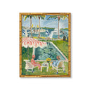
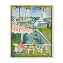
A piece like Carrying the Sunshine by Katy Neely, with its lively mix of orange, blue, pink, and green, could inspire a room with rich blue upholstery, warm terracotta accents, and touches of softer color. Pair those expressive hues with natural wood, woven textiles, and warm white walls for a space that feels inviting rather than overwhelming.
How to Balance Bold Colors in a Living Room
Color has an extraordinary ability to influence how the space feels. Bright colors can bring energy and life to a room, while deeper, more saturated shades create ambiance and a sense of intimacy. When choosing colorful art pieces, consider the mood you want to establish and how the artwork will interact with the surrounding walls, patterns, and furnishings.
We particularly love the way expressive artwork with patterned wallpaper can work together to create striking combinations. A traditional floral or delicate stripe can beautifully contrast a contemporary abstract, while a botanical might complement a wallpaper design with similar colors but a different pattern scale. The key is to create a relationship between the two without making them compete for attention. You can explore our entire Wallpaper Collection to find a style that works best with your unique space.
Consider the color proportions throughout the room, too. The familiar 60-30-10 rule suggests using a dominant color for approximately 60% of the space, a secondary shade for 30%, and an accent for the remaining 10%. While we don’t believe beautiful interiors need to follow an exact formula, the principle can keep a colorful room feeling balanced. You can learn more about this in our full guide on choosing the right art print size for any room.
If your artwork features several vibrant hues, allow one or two to appear in the surrounding wallpaper or furnishings while giving the remaining colors a little breathing room. Natural wood, warm white, and softly textured fabrics can provide a beautiful counterpoint, allowing the art to remain the focal point.
For more inspiration, explore our Shop the Look gallery to see how fine art and wallpaper come together in styled spaces.
Consider Scale, Framing, and Placement
Even the most striking piece of fine art needs the right presentation. Scale, framing, and placement can add depth to a room’s design, while a carefully chosen frame helps the artwork complement the surrounding architectural elements. The goal is to give colorful artwork enough presence to create a dramatic effect without claiming the space. Our Size Guide covers this in detail.
In a living room, we often recommend choosing artwork that measures approximately two-thirds to three-quarters the width of the sofa beneath it. A substantial framed print or wrapped canvas gives vibrant colors room to make an impression, while a carefully curated pair can create a similar effect with more movement and visual interest.
Framing offers another opportunity to bring the room’s color story together. A natural wood frame can soften the intensity of a brightly colored abstract, while one of our decorative gold bamboo frames brings warmth and character to a more traditional space.
Explore our frame collection to find a finish that complements both the artwork and the surrounding furnishings.
Placement is equally important. Above a sofa, mantel, or console, colorful artwork should feel connected to the furnishings beneath it rather than floating independently on the wall. Leave enough breathing room around the composition for its colors and details to be appreciated, and consider how natural light changes the appearance of those colors throughout the day.
Bring Your Colorful Interior to Life With Urban Garden Prints
The most memorable colorful interiors are often those that begin with something personal. A painting that catches your eye, an unexpected color combination, or a piece of art you simply can’t stop thinking about can become the inspiration for an entire room.
At Urban Garden Prints, we believe fine art should be an integral part of creating a home that feels distinctly yours. Our curated fine art print collection features work by independent artists, from expressive abstracts and colorful botanicals to landscapes rich with character and depth.
Whether you’re drawn to vibrant hues or prefer introducing bold color through smaller details, let the artwork you love lead the way. The result is a home filled with color, personality, and pieces you’ll enjoy for years to come.



Colorful Interior Design: Bold Color Combos Anchored By Art
Some of the most memorable interiors are those that embrace color with confidence. Rich blues, warm ochres, expressive greens, and unexpected touches of pink can bring extraordinary personality to a room, particularly where the colors feel thoughtfully connected.
While a beautiful color palette can start with a favorite fabric or a carefully selected wall color, we believe fine art offers an especially inspiring place to begin.
A colorful landscape, expressive abstract, or painterly botanical can introduce shades you might never have considered pairing together. When those colors carry through upholstery, textiles, and architectural details, the result feels layered and personal rather than overly coordinated.
The secret to colorful interior design isn’t simply introducing more color. It’s knowing how to create a beautiful relationship between the artwork, furnishings, and surrounding space.
Why Art Is the Perfect Starting Point for a Colorful Interior
There’s a certain confidence to a room where color feels expressive yet beautifully balanced. Often, that sense of harmony begins with the artwork.
A thoughtfully chosen painting brings together colors, movement, and composition in a way that can inspire the entire space. Consider Pink and Green by Love Katie Darling, an expressive botanical composition that brings two lively colors together in one piece of fine art. A rich green accent chair or pink-patterned upholstery could carry those shades into the surrounding room, creating a colorful interior that still feels beautifully considered.
In a living room, a substantial piece of fine art above the sofa can establish a natural focal point, drawing attention and giving the surrounding furnishings a sense of direction. Whether you prefer bold colors or more subtle shades, the right artwork can transform the mood of an entire room, creating a cohesive look that still feels personal.
And perhaps most importantly, choosing artwork you genuinely love gives the room a personal point of view. The result is a colorful interior that feels collected over time rather than designed around a passing trend.
Let Fine Art Lead Your Color Palette
Once you’ve found a piece of artwork you love, look beyond its most prominent colors. Some of the most interesting design possibilities come from the smaller details that give a piece its depth and character: a hint of ochre in a landscape, a deep burgundy brushstroke in an abstract, or a soft blue tucked among vibrant florals.
Choose one or two shades to repeat throughout the room, then let the remaining colors appear more subtly. For example, a painting with rich blues, golden yellows, and touches of pink might inspire navy upholstery, patterned throw pillows, and a warm ochre accent chair. Neutral furniture, natural wood, and woven textures can balance the brighter shades, giving the room depth without taking attention away from the artwork.
You don’t need to match every shade perfectly, either. In fact, slight variations in tone often make a room feel more layered and interesting. Whether you’re working with your favorite color or exploring an unexpected combination, the goal is to connect the artwork to the surrounding furnishings while letting each element keep its own character.
Bold Color Combinations That Feel Timeless
Bold colors don’t have to cover every wall to make an impression. Some of the most striking interior spaces combine expressive artwork with neutral colors, classic furnishings, and smaller bold accents that add character without overwhelming the room.
Here are a few color combinations we particularly love for creating spaces that feel expressive, sophisticated, and full of personality:
Pink and Green: Playful Meets Traditional
Pink and green are a natural pairing, especially in interiors that combine traditional details with a more playful approach to color. Think deep olive upholstery, soft blush walls, and patterned pillows that bring both shades into the room.
A colorful botanical can feel especially at home alongside antique wood furniture, decorative millwork, and warm brass accents. The contrast between expressive artwork and classic architectural details adds contrast, visual interest, and a sense of character.
Aqua, Pink, and Golden Yellow: An Expressive, Layered Palette
For a more colorful approach, consider the La Dee Da Pair by Charlotte Pottieger, a vibrant abstract pairing that brings together aqua, pink, golden tones, and other playful shades.
In a living room, soft aqua upholstery could establish the foundation, while pink-patterned throw pillows and golden yellow accessories introduce warmth and contrast. Natural wood, creamy linen, and a simple rug help balance the brighter colors, creating an inviting environment that feels lively without becoming overwhelming.
Because the artwork already brings these shades together, the room can feel beautifully layered without relying on perfectly matched furnishings.
Orange and Blue: A Classic Contrast With Personality
Orange and blue sit opposite one another on the color wheel, making them a particularly striking combination. The key is choosing shades that feel appropriate for the surrounding architecture and furnishings.
A piece like Carrying the Sunshine by Katy Neely, with its lively mix of orange, blue, pink, and green, could inspire a room with rich blue upholstery, warm terracotta accents, and touches of softer color. Pair those expressive hues with natural wood, woven textiles, and warm white walls for a space that feels inviting rather than overwhelming.
How to Balance Bold Colors in a Living Room
Color has an extraordinary ability to influence how the space feels. Bright colors can bring energy and life to a room, while deeper, more saturated shades create ambiance and a sense of intimacy. When choosing colorful art pieces, consider the mood you want to establish and how the artwork will interact with the surrounding walls, patterns, and furnishings.
We particularly love the way expressive artwork with patterned wallpaper can work together to create striking combinations. A traditional floral or delicate stripe can beautifully contrast a contemporary abstract, while a botanical might complement a wallpaper design with similar colors but a different pattern scale. The key is to create a relationship between the two without making them compete for attention. You can explore our entire Wallpaper Collection to find a style that works best with your unique space.
Consider the color proportions throughout the room, too. The familiar 60-30-10 rule suggests using a dominant color for approximately 60% of the space, a secondary shade for 30%, and an accent for the remaining 10%. While we don’t believe beautiful interiors need to follow an exact formula, the principle can keep a colorful room feeling balanced. You can learn more about this in our full guide on choosing the right art print size for any room.
If your artwork features several vibrant hues, allow one or two to appear in the surrounding wallpaper or furnishings while giving the remaining colors a little breathing room. Natural wood, warm white, and softly textured fabrics can provide a beautiful counterpoint, allowing the art to remain the focal point.
For more inspiration, explore our Shop the Look gallery to see how fine art and wallpaper come together in styled spaces.
Consider Scale, Framing, and Placement
Even the most striking piece of fine art needs the right presentation. Scale, framing, and placement can add depth to a room’s design, while a carefully chosen frame helps the artwork complement the surrounding architectural elements. The goal is to give colorful artwork enough presence to create a dramatic effect without claiming the space. Our Size Guide covers this in detail.
In a living room, we often recommend choosing artwork that measures approximately two-thirds to three-quarters the width of the sofa beneath it. A substantial framed print or wrapped canvas gives vibrant colors room to make an impression, while a carefully curated pair can create a similar effect with more movement and visual interest.
Framing offers another opportunity to bring the room’s color story together. A natural wood frame can soften the intensity of a brightly colored abstract, while one of our decorative gold bamboo frames brings warmth and character to a more traditional space.
Explore our frame collection to find a finish that complements both the artwork and the surrounding furnishings.
Placement is equally important. Above a sofa, mantel, or console, colorful artwork should feel connected to the furnishings beneath it rather than floating independently on the wall. Leave enough breathing room around the composition for its colors and details to be appreciated, and consider how natural light changes the appearance of those colors throughout the day.
Bring Your Colorful Interior to Life With Urban Garden Prints
The most memorable colorful interiors are often those that begin with something personal. A painting that catches your eye, an unexpected color combination, or a piece of art you simply can’t stop thinking about can become the inspiration for an entire room.
At Urban Garden Prints, we believe fine art should be an integral part of creating a home that feels distinctly yours. Our curated fine art print collection features work by independent artists, from expressive abstracts and colorful botanicals to landscapes rich with character and depth.
Whether you’re drawn to vibrant hues or prefer introducing bold color through smaller details, let the artwork you love lead the way. The result is a home filled with color, personality, and pieces you’ll enjoy for years to come.