Every spring, design shifts just enough to feel fresh without abandoning what we love. This year feels grounded, layered, and more confident. Homes are leaning warmer. Spaces feel curated. And art and wallpaper are stepping back into the spotlight in a big way.

Here is what we are seeing everywhere this season and how to bring it home beautifully.
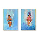
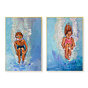
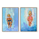
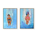
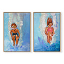
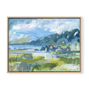
Pictured: Everything's Oakay Pair by Lauren Smith
GREEN, EVERYWHERE
Green is not just a color trend. It is a mood.
From sage to olive to deep forest, green is showing up on walls, upholstery, cabinetry, and textiles. It feels grounding and organic but still fresh for spring. It pairs beautifully with antique brass, woven textures, and natural wood tones.
Wallpaper is one of the most impactful ways to introduce green. A soft floral in a bedroom, a deeper moody plaid in a dining room, or even a subtle green pattern in a powder bath instantly creates depth and character.
How to use it:
Layer green through wallpaper, then echo it in your art selection. Landscapes and abstract botanicals feel especially right this season and create a cohesive story when paired with patterned walls.

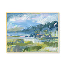
Pictured: Seaside Trellis Wallpaper & Marsh 2 by Jenny Westenhofer
SHELLS ARE HAVING A MOMENT
Shells are no longer just coastal kitsch. They are elevated, sculptural, and surprisingly versatile.
We are seeing shell motifs in art, mirrors, lighting, and decorative objects. Think collected, not themed. A framed shell print or a sculptural shell mirror adds interest without feeling beachy.
Shell inspired wallpaper is also having its moment. A subtle scallop or organic coastal pattern can add quiet movement to a space without overpowering it.
How to use it:
Layer a shell inspired wallpaper in a small space like a powder room or entry, then anchor it with timeless art in richer tones. Swap your art for something that leans a little bit more coastal chic with a shell motif. The contrast keeps it sophisticated.

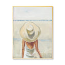
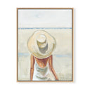
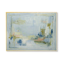
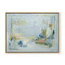
Pictured: Fall of Summer by Lauren Smith
BOLD ART IN NEUTRAL SPACES
Neutrals are not going anywhere. But the art is getting braver.
We are seeing rooms layered in creams, taupes, and warm whites with one confident, colorful piece commanding the wall. Scale matters here. Oversized art or a strong pair makes the space feel intentional and complete.
Wallpaper plays beautifully here as well. A subtle neutral wallpaper with texture or a small scale pattern can create dimension without competing with bold art.
How to use it:
If your furniture and walls are neutral, let the art carry the color story. If you want added depth, choose a soft patterned wallpaper that enhances the art rather than distracts from it.

Pictured: Pink & Blue Botanical Square Set of 4 by Cady Karras
PATTERN MIXING WITH CONFIDENCE
Matching sets are out. Thoughtful mixing is in.
Patterned lampshades with patterned pillows. Stripes with florals. Block prints with subtle geometrics. And yes, wallpaper layered into the mix.
The key is variation in scale. Pair a larger scale wallpaper with smaller scale textiles. Or choose a quieter wallpaper and let the pillows and art bring the energy.
How to use it:
Start with one anchor pattern, often the wallpaper. Then build around it with complementary patterns in different scales. Let the art act as the visual pause that ties everything together.
EFFORTLESS LAYERING
This season is about depth.
Layered textiles. Mixed metals. Different wood tones in the same room. Wallpaper behind art. Frames layered over patterned walls. Spaces feel curated over time rather than perfectly matched.
Wallpaper instantly adds that first layer. Art adds the second. Styling finishes the story.
How to use it:
Do not be afraid to hang art over wallpaper. In fact, it often looks richer. Mix warm brass with darker woods. Add texture in fabrics. A little more is sometimes exactly right.
RICHER WOOD TONES
Light oak had a long run. Now we are seeing the return of warmth.
Walnut, mahogany, and deeper stained finishes are coming back into focus. They ground a space and make lighter fabrics, bold art, and patterned wallpaper pop beautifully.
How to use it:
Introduce darker wood through a console, frame, or dining table. Pair it with wallpaper in softer tones and art that pulls both together. The result feels layered and intentional.
BRINGING IT ALL TOGETHER
What ties all of these trends together is confidence and character. Green next to mahogany. Shell art above a bold pillow. Patterned wallpaper layered with bold abstract pieces. Mixed patterns that feel collected rather than coordinated.
Spring 2026 is not about starting over. It is about building on what you have and adding thoughtful layers, one at a time.
Art and wallpaper set the foundation. Everything else builds from there.


The Spring Trend Report
Every spring, design shifts just enough to feel fresh without abandoning what we love. This year feels grounded, layered, and more confident. Homes are leaning warmer. Spaces feel curated. And art and wallpaper are stepping back into the spotlight in a big way.

Here is what we are seeing everywhere this season and how to bring it home beautifully.
Pictured: Everything's Oakay Pair by Lauren Smith
GREEN, EVERYWHERE
Green is not just a color trend. It is a mood.
From sage to olive to deep forest, green is showing up on walls, upholstery, cabinetry, and textiles. It feels grounding and organic but still fresh for spring. It pairs beautifully with antique brass, woven textures, and natural wood tones.
Wallpaper is one of the most impactful ways to introduce green. A soft floral in a bedroom, a deeper moody plaid in a dining room, or even a subtle green pattern in a powder bath instantly creates depth and character.
How to use it:
Layer green through wallpaper, then echo it in your art selection. Landscapes and abstract botanicals feel especially right this season and create a cohesive story when paired with patterned walls.
Pictured: Seaside Trellis Wallpaper & Marsh 2 by Jenny Westenhofer
SHELLS ARE HAVING A MOMENT
Shells are no longer just coastal kitsch. They are elevated, sculptural, and surprisingly versatile.
We are seeing shell motifs in art, mirrors, lighting, and decorative objects. Think collected, not themed. A framed shell print or a sculptural shell mirror adds interest without feeling beachy.
Shell inspired wallpaper is also having its moment. A subtle scallop or organic coastal pattern can add quiet movement to a space without overpowering it.
How to use it:
Layer a shell inspired wallpaper in a small space like a powder room or entry, then anchor it with timeless art in richer tones. Swap your art for something that leans a little bit more coastal chic with a shell motif. The contrast keeps it sophisticated.
Pictured: Fall of Summer by Lauren Smith
BOLD ART IN NEUTRAL SPACES
Neutrals are not going anywhere. But the art is getting braver.
We are seeing rooms layered in creams, taupes, and warm whites with one confident, colorful piece commanding the wall. Scale matters here. Oversized art or a strong pair makes the space feel intentional and complete.
Wallpaper plays beautifully here as well. A subtle neutral wallpaper with texture or a small scale pattern can create dimension without competing with bold art.
How to use it:
If your furniture and walls are neutral, let the art carry the color story. If you want added depth, choose a soft patterned wallpaper that enhances the art rather than distracts from it.
Pictured: Pink & Blue Botanical Square Set of 4 by Cady Karras
PATTERN MIXING WITH CONFIDENCE
Matching sets are out. Thoughtful mixing is in.
Patterned lampshades with patterned pillows. Stripes with florals. Block prints with subtle geometrics. And yes, wallpaper layered into the mix.
The key is variation in scale. Pair a larger scale wallpaper with smaller scale textiles. Or choose a quieter wallpaper and let the pillows and art bring the energy.
How to use it:
Start with one anchor pattern, often the wallpaper. Then build around it with complementary patterns in different scales. Let the art act as the visual pause that ties everything together.
EFFORTLESS LAYERING
This season is about depth.
Layered textiles. Mixed metals. Different wood tones in the same room. Wallpaper behind art. Frames layered over patterned walls. Spaces feel curated over time rather than perfectly matched.
Wallpaper instantly adds that first layer. Art adds the second. Styling finishes the story.
How to use it:
Do not be afraid to hang art over wallpaper. In fact, it often looks richer. Mix warm brass with darker woods. Add texture in fabrics. A little more is sometimes exactly right.
RICHER WOOD TONES
Light oak had a long run. Now we are seeing the return of warmth.
Walnut, mahogany, and deeper stained finishes are coming back into focus. They ground a space and make lighter fabrics, bold art, and patterned wallpaper pop beautifully.
How to use it:
Introduce darker wood through a console, frame, or dining table. Pair it with wallpaper in softer tones and art that pulls both together. The result feels layered and intentional.
BRINGING IT ALL TOGETHER
What ties all of these trends together is confidence and character. Green next to mahogany. Shell art above a bold pillow. Patterned wallpaper layered with bold abstract pieces. Mixed patterns that feel collected rather than coordinated.
Spring 2026 is not about starting over. It is about building on what you have and adding thoughtful layers, one at a time.
Art and wallpaper set the foundation. Everything else builds from there.